
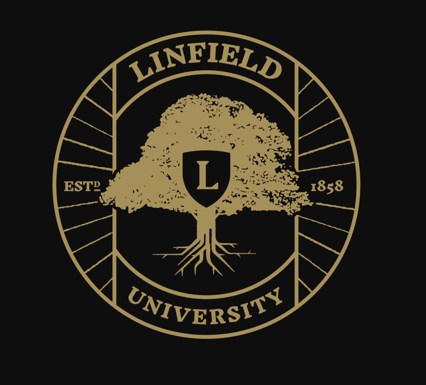
Shield or acorn, the new Linfield logo doesn’t meet student expectations

The new Linfield Logo was created by graphic designers who wanted to incorporate the historic image of the acorn and oak tree at Linfield.
November 12, 2020
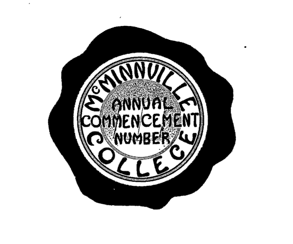
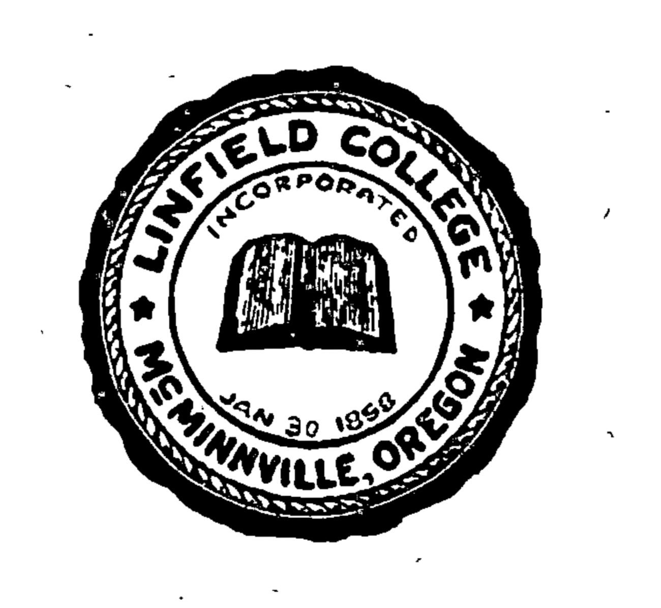
It has been 10 years since Linfield’s last rebrand which came after a shift in the school’s identity from McMinnville College to Linfield College. Now, after the transition to Linfield University, the school represents itself with a fresh logo and seal that attempt to maintain the university’s core values.
The updated logo presents a sleek bolded L surrounded by white space with a loose cap-like line over the top meant to insinuate an acorn in the viewers mind. The L is nestled in royal purple oak leaves.
For a tiny graphic design element, the logo has to do a lot of communication work.
University rebrands are some of the hardest rebrands, according to Patrick Macomber, the creative director at 160over90– the creative agency hired to help with the rebranding. For Linfield, the most challenging aspect of its recent rebrand was finding a logo that appeals to all patrons of the school.
“There are so many audiences that you have to make feel at home with it,” Macomber said.
Macomber views logos as brand punctuation, “We often look at identities as the strong punctuation to the communication that you see around it.” In this case, Linfield’s new logo is a signal for change and transition, or as Macomber said, “a movement towards something incredible.”
Scott Nelson, Linfield’s Chief Marketing Officer and Linfield alumnus charged the creative team with updating what was done 10 years ago to a logo that would, “make it feel more modern, make it feel more like a University, but hold on to the heritage and the history and the traditions of Linfield,” Nelson said.
Amanda Doyle, the account director, mediates idea flow between client and creative team at 160over90. She describes the process as, “much more than the logo and the seal.”
In the “discovery process,” Doyle and her team of creative gurus visited Linfield on multiple occasions for a more immersive branding experience. These campus visits provided insight into student opinion, and a chance to see what campus looks like.
“We wanted to make sure everything that we were going to articulate through our creative lens was going to be authentic and relevant to everyone that lives the brand every day,” Doyle said.


The team presented Nelson and Linfield’s graphic designer, Candido Salinas, with two different images: the logo, and the seal.
The seal, an extension of the Linfield brand is meant only for high levels of communication such as graduation diplomas and official documents.
The logo is a primary mark that is meant to represent the University in an outward fashion, “it is something to put on everything, something to be proud of,” Macomber said.
Students on campus are not quite sure how to interpret the logo. Some like it, but others have a hard time identifying with it.
Senior journalism and media studies major Nathaly Sanchez said, “The logo itself is dreadfully basic and purple, and even a touch pretentious compared to the old one.” She continues, “Today when I see it, I can tell it has sort of grown on me.” Sanchez admits bias on the topic since she has know the old logo for so long.
One thought behind the creative process, according to Macomber, was to create a logo that resonated with audiences outside of the Oregon region. But, responses from students reflect that, in the process, the logo lost the small college charm that made it so memorable.
Sophomore Brielle Kromer said the old logo was instantly recognizable, it’s simplicity and lack of straight edges conjuring fall scenes and the changing of seasons something so central to Linfield’s physical appearance.
Linfield students may know Kromer from her leadership in the Outdoor Recreation Program at Linfield. “The new logo is very strong; the sharp lines and symbolism of the shield shows strength. It’s instantly recognizable when you see it, but it lacks the warmth of the simple acorn and leaf,” Kromer said not realizing the intention of the shape to be an acorn.
Kromer is not the only student who struggled with the shape behind the logo. Many students around campus have been debating the matter as if it were the tip-jar survey at Cold Stone. The team intended to play upon the logo’s historic association with acorns expecting target audiences to automatically make the association with the college’s brand identity.
Hugh Hammons, a senior digital art major chews on the shield or acorn debate, while also feeling concerned over the distinguishability of the logo, “You could switch out Linfield for any university name and it wouldn’t lose anything,” he said.
In an interview, Salinas, the Linfield graphic designer, debunked the shield rumors, “It’s an acorn. Let me set the record straight right now,” he said.
Kyle Ferino, a creative director from 160over90 interjects clarification of his own, “we were kind of trying to push the envelope a little bit by playing with negative space, and having the leaves take the shape of the acorn while letting the top be a little less concrete.”
Some students understood this creative vision. Camille Lubach, a Sophomore, said, “I’m actually a fan of the logo. The acorn motif is something I love about Linfield, so I’m glad that it’s incorporated into our new logo.”
Students mourn the loss of personality in the new logo, Kerry Grant, a junior in the creative writing department said, “In truth, it looks,” she paused then finished the sentence with a reluctant “fine.” Then she continued, “it feels bigger and less personal, but it’s not ugly or anything.”
“I think that is the beauty of seeing things like this come to fruition. Everyone is going to have some kind of subjective opinion on whether it resonates with them,” Ferino said.
New students embrace the logo, nonetheless. A freshman football player named Gregory Filardo said, “I like the logo. I think the symbolism around the acorn is really cool.”
In general, designers find it essential to have a strong foundational understanding of the brands existing identity before developing something new, according to Macomber. During the Linfield rebrand, the logo and seal were each assigned a team of three designers.
Once designers have a few drafts, it is common to shop different design ideas around internally, “Then discuss, does this feel like the right solution? Is it steeped in the brand enough,” Ferino said.
The editing stage of the design process is a highlight for Macomber because it is so collaborative.
This logo design was particularly collaborative, Ferino pointed out, because the team had more time to test the logo on focus groups. He is referring to an opportunity the team had to present different logo options to the student and alumni focus groups and receive their feedback.
Though, not all students felt incorporated in the design process. Lubach is considered a leader on the Linfield campus for her work in the student garden and art department, in addition to her bubbly and caring attitude.
Yet despite being a more prominent Linfield personality, she was left out of the design process along with other art students.
Lubach mentioned the missed opportunity to consult with art students during the design process, “Linfield paid a professional digital designer rather than giving art students the opportunity to design their own logo, one that will be proudly shown everywhere for decades to come.”
Elliot Montriband, a sophomore in the digital arts major said, “I would have loved if the college asked art students, or even any student, to create a logo but I understand why they didn’t. It needs to be professionally made and we aren’t professionals yet.”
Perhaps this stately logo is a representation of Linfield’s future, but it does not resonate with the Linfield that most students know and love today.